BaoBao
Multi-Vendor Checkout Flow Redesign
Project Type
Checkout + UI Redesign
Design Status
Leader
Deliverables
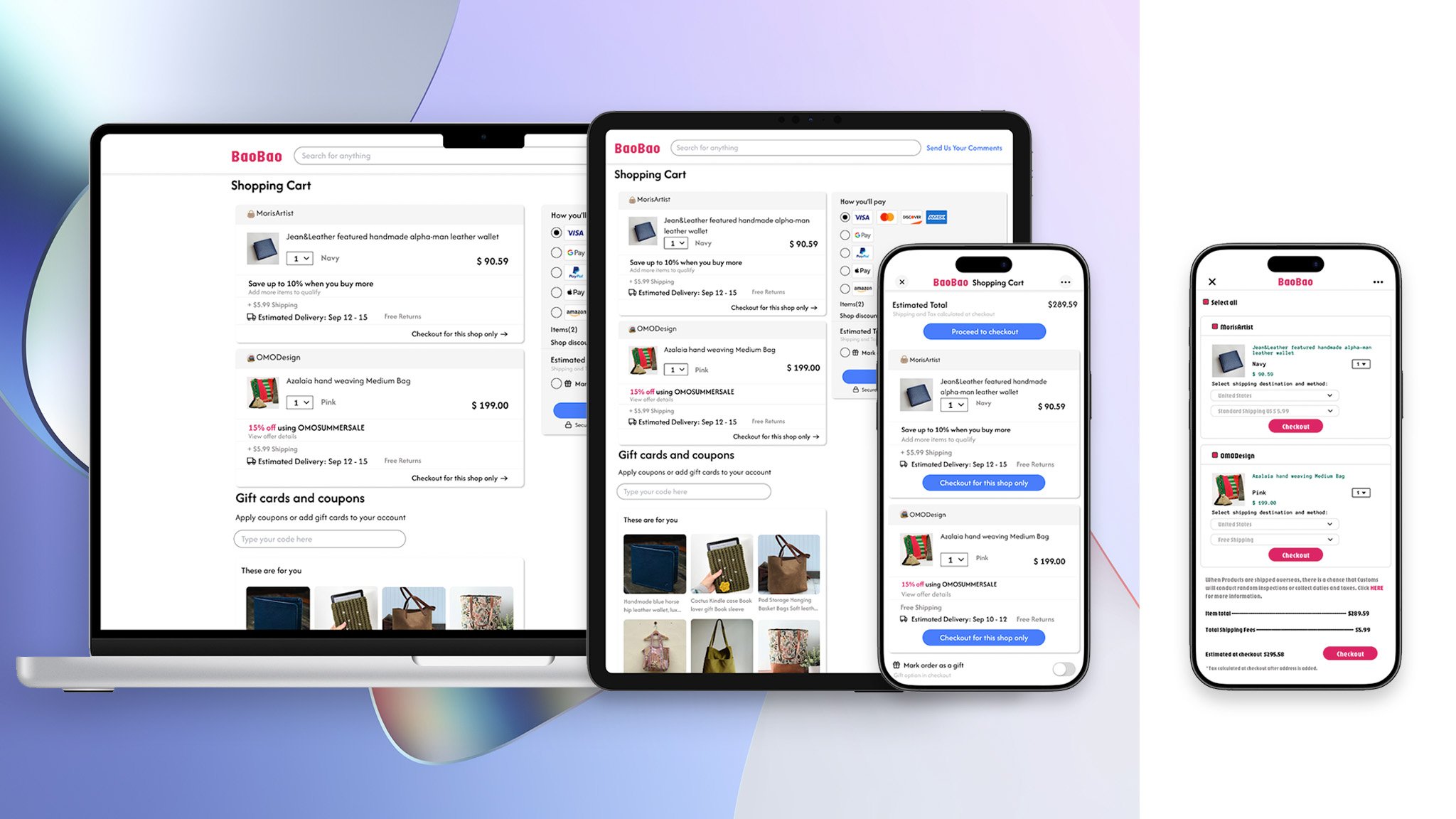
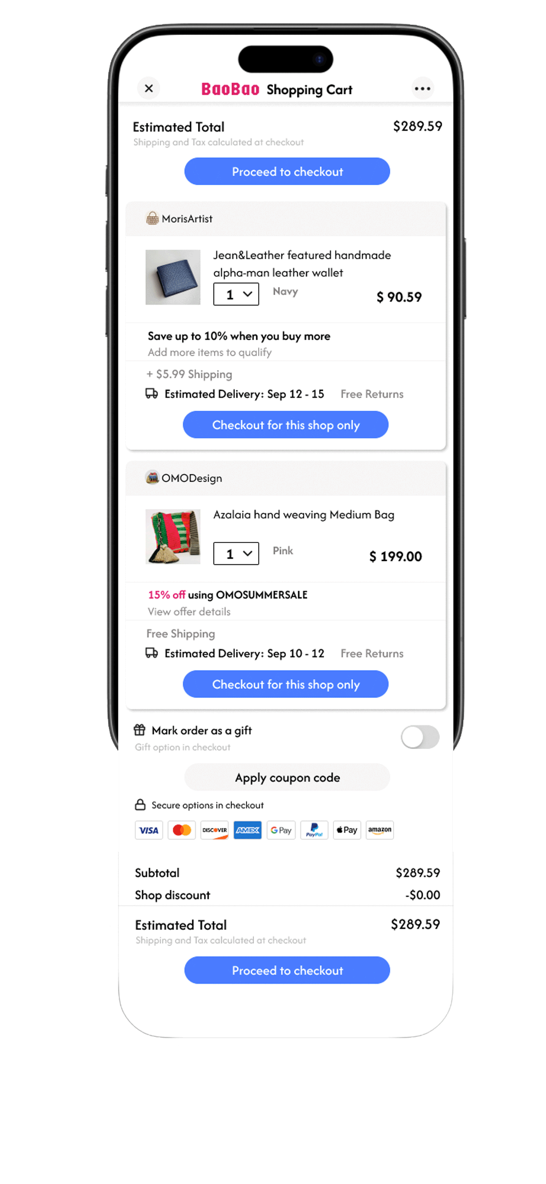
After
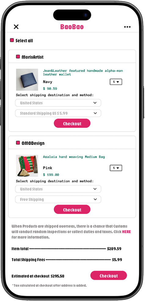
Before
01.Overview
The redesigned checkout flow drove clear gains in trust, efficiency, and mobile performance — here are the key metrics:
+28%
Checkout Completion Rate
Streamlined steps reduced friction and hesitation.
+41%
Successful Error Recovery Rate
Improved Form Resilience Prevented Drop-offs.
-47%
Drop-off at Shipping Step
Smarter defaults simplified complex delivery logic.
-60%
Form Abandonment
Inline error handling helped users stay in flow.
+36%
Perceived Trust Score
Unified visuals and payment security indicators improved confidence.
+52%
Mobile Completion Rate
Responsive layout and larger targets boosted mobile usability.
I redesigned the checkout experience for a multi-vendor platform selling handcrafted bags from independent artists — each with distinct shipping rules and fulfillment flows.
The original checkout was fragmented, untrustworthy, and poorly optimized for mobile, leading to user drop-offs and lost revenue.
By simplifying complexity, reinforcing trust, and improving cross-device usability, I delivered measurable improvements across both user experience and business outcomes.
02.Challenge & Insight
“I just wanted to buy the bag, but there were too many shipping options, too many forms — and I wasn’t even sure if the payment went through.”
— Real user comment via feedback widget
This was not an isolated complaint — it was one of many that surfaced during a product feedback review. When my client saw this comment, it finally gave form to what had previously felt like vague dissatisfaction: the checkout experience was broken.
To investigate further, I set up a lightweight comment aggregation system using Hotjar and Zendesk, and reviewed over 120 user comments over the course of two weeks. In parallel, I conducted competitor flow audits (Shopify, Etsy), industry benchmarking (via Baymard reports), and studied behavioral recordings through heatmaps and funnel drop-off analysis.
Through this research, I surfaced five recurring issues:
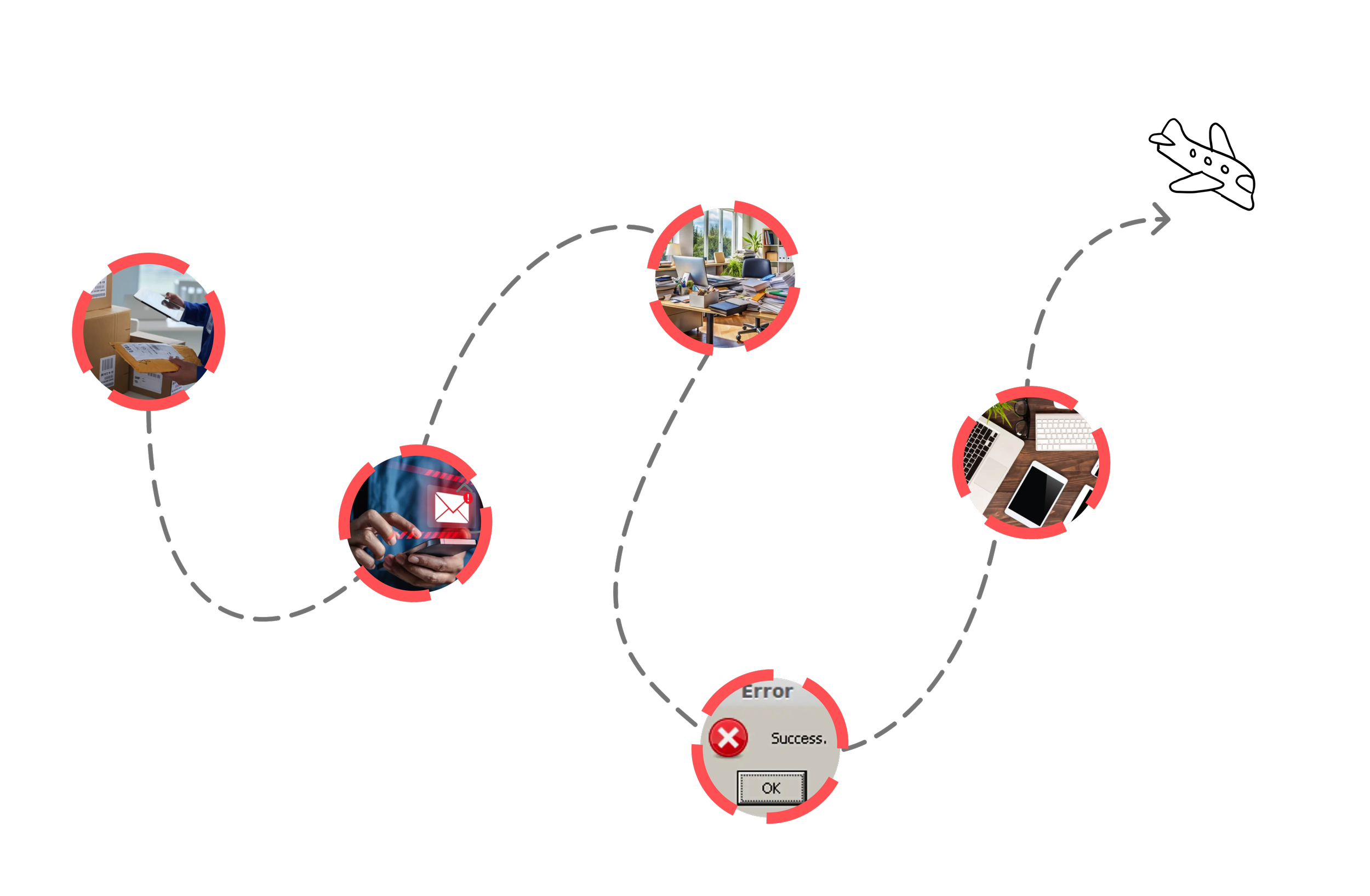
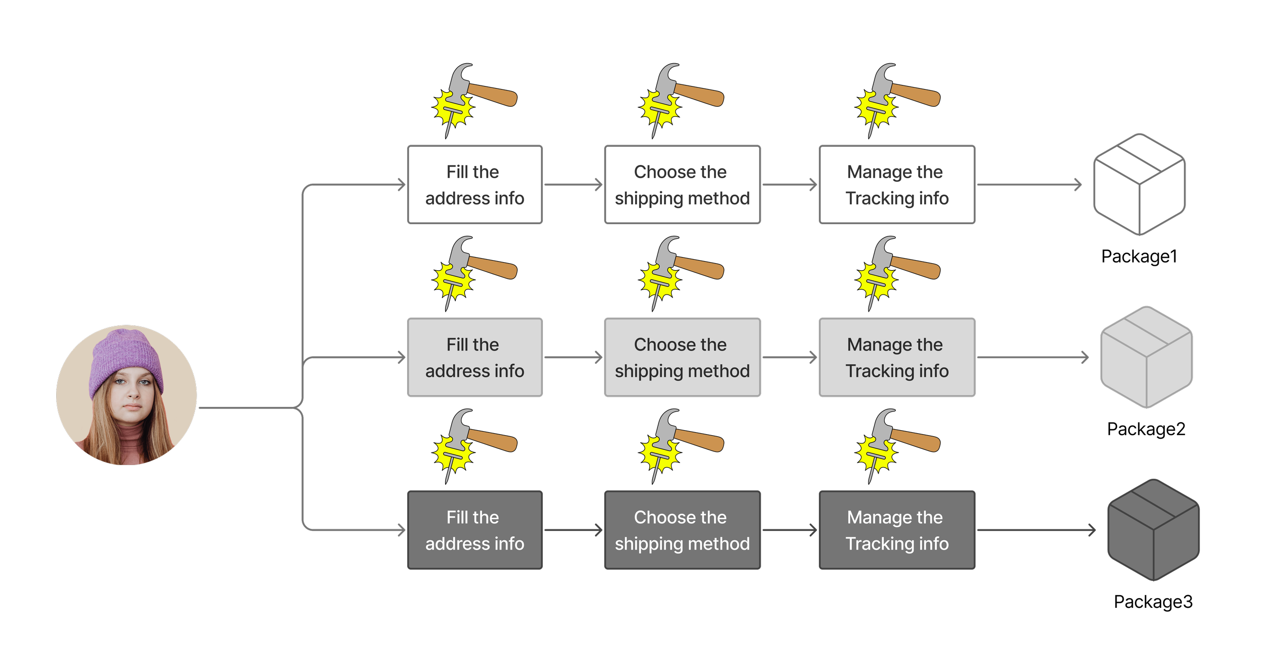
Fragmented shipping logic — Users were overwhelmed by multiple seller-based logistics.
Low trust signals — Inconsistent UI and missing security indicators caused drop-offs.
Slow, jumpy flow — Every step was a page reload; no memory of progress.
Poor error handling — One typo often meant starting over.
Mobile-hostile UX — Small buttons, broken layout, no responsiveness.
These issues weren't just usability concerns — they were hurting trust, revenue, and long-term retention.
Fragmented shipping experience
Low Trust UI
Slow jumpy flow
Hostile UX
Poor error handling
Broken existing checkout experience
03.Solutions
Simpler Flow, Stronger Trust.
Faster Checkout, Better Results.
Too Much to Think, Too Easy to Quit
When users have to compare shipping options, track split deliveries, and fill endless forms — they give up. This redesign took the burden off the user, and put logic back in the system.
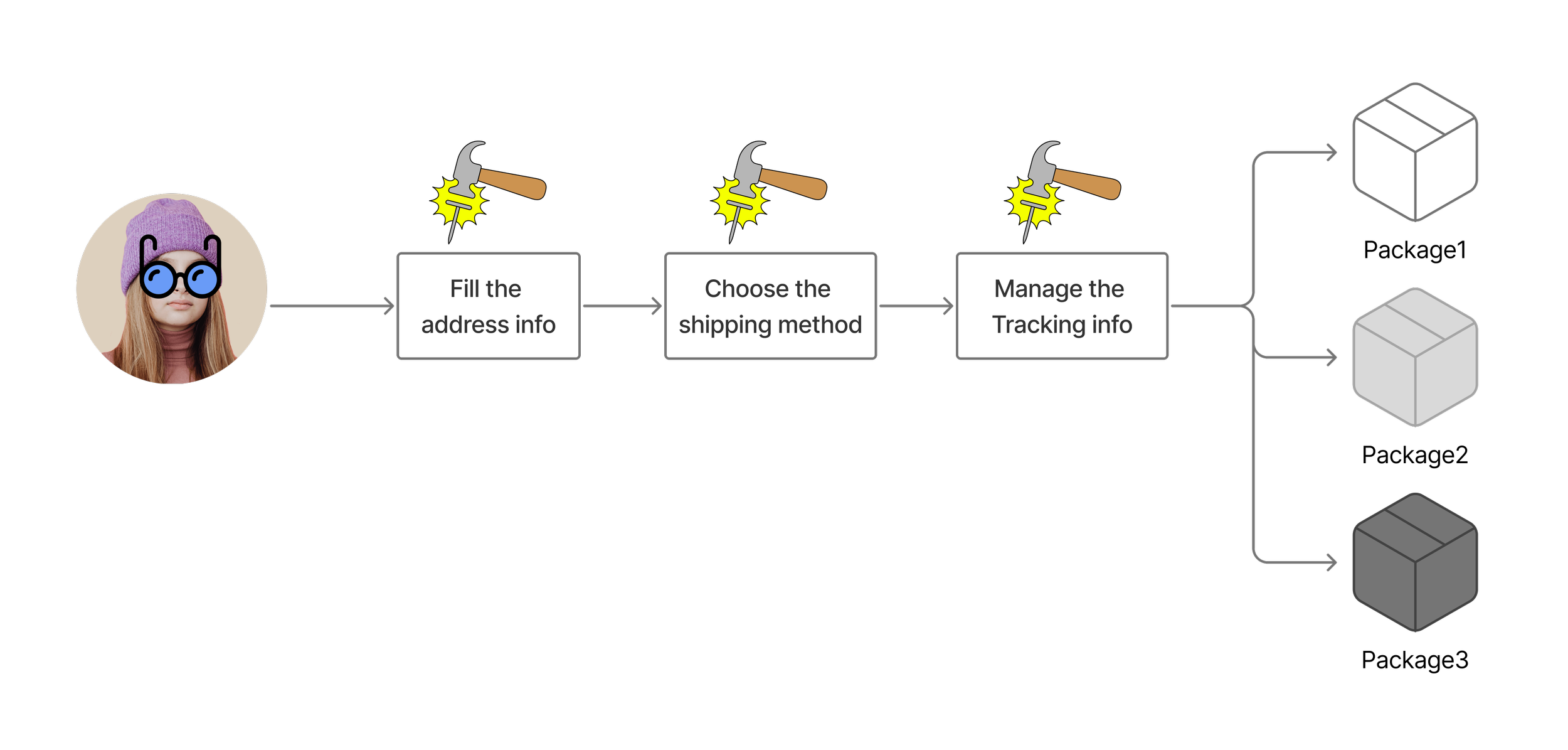
Name: Susan Age:27 Love Buying Bags.
“I thought I came to buy a bag, but it feels like I’m here to fill out paperwork.”
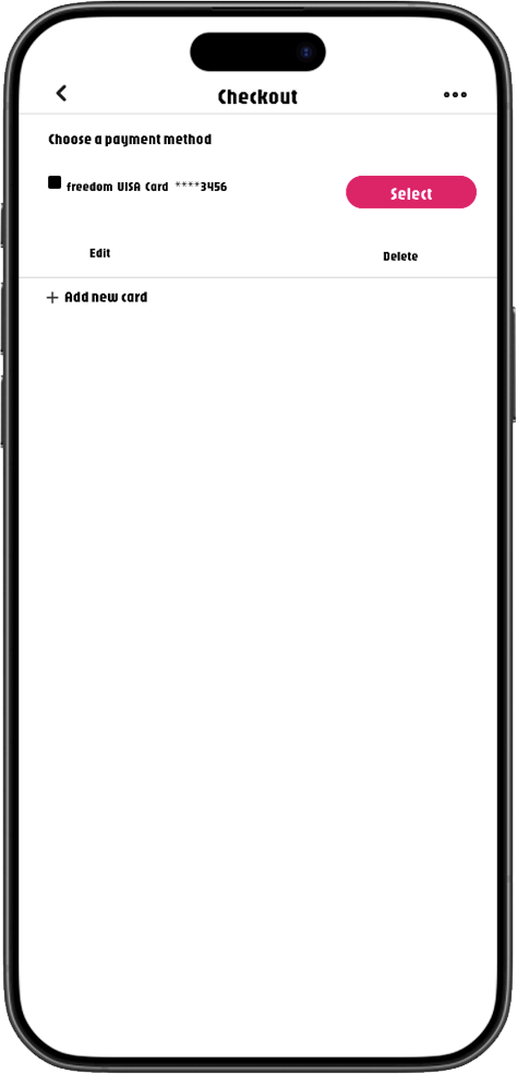
Before
User effort exceeds what the experience is worth.
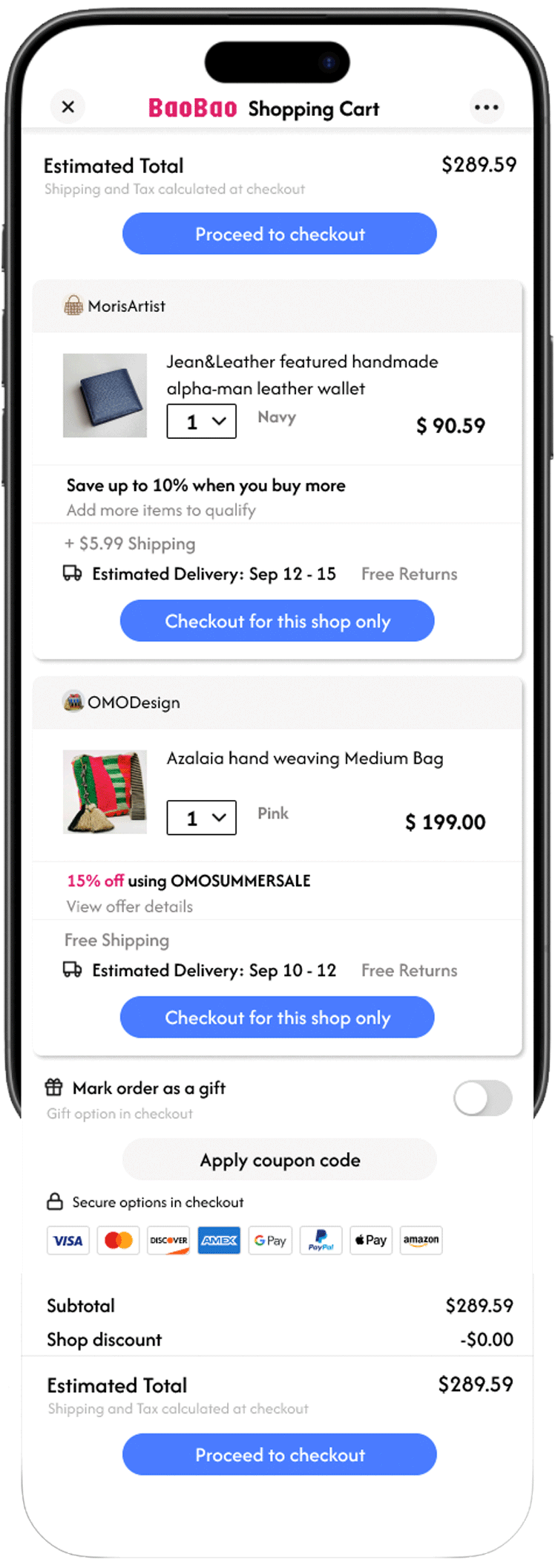
After
“Now that it’s this easy to check out... I’m just worried I might buy too many bags.”
Building Trust Through Visual Clarity and Transparency.
Typography Hierarchy
Small and dense, hard to scan
Payment Indicators
Credit card input only
Security Cues
Missing or vague
Visual Tone
Cluttered, untrustworthy
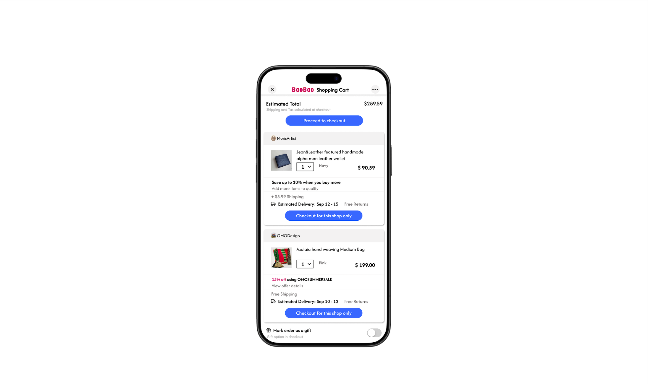
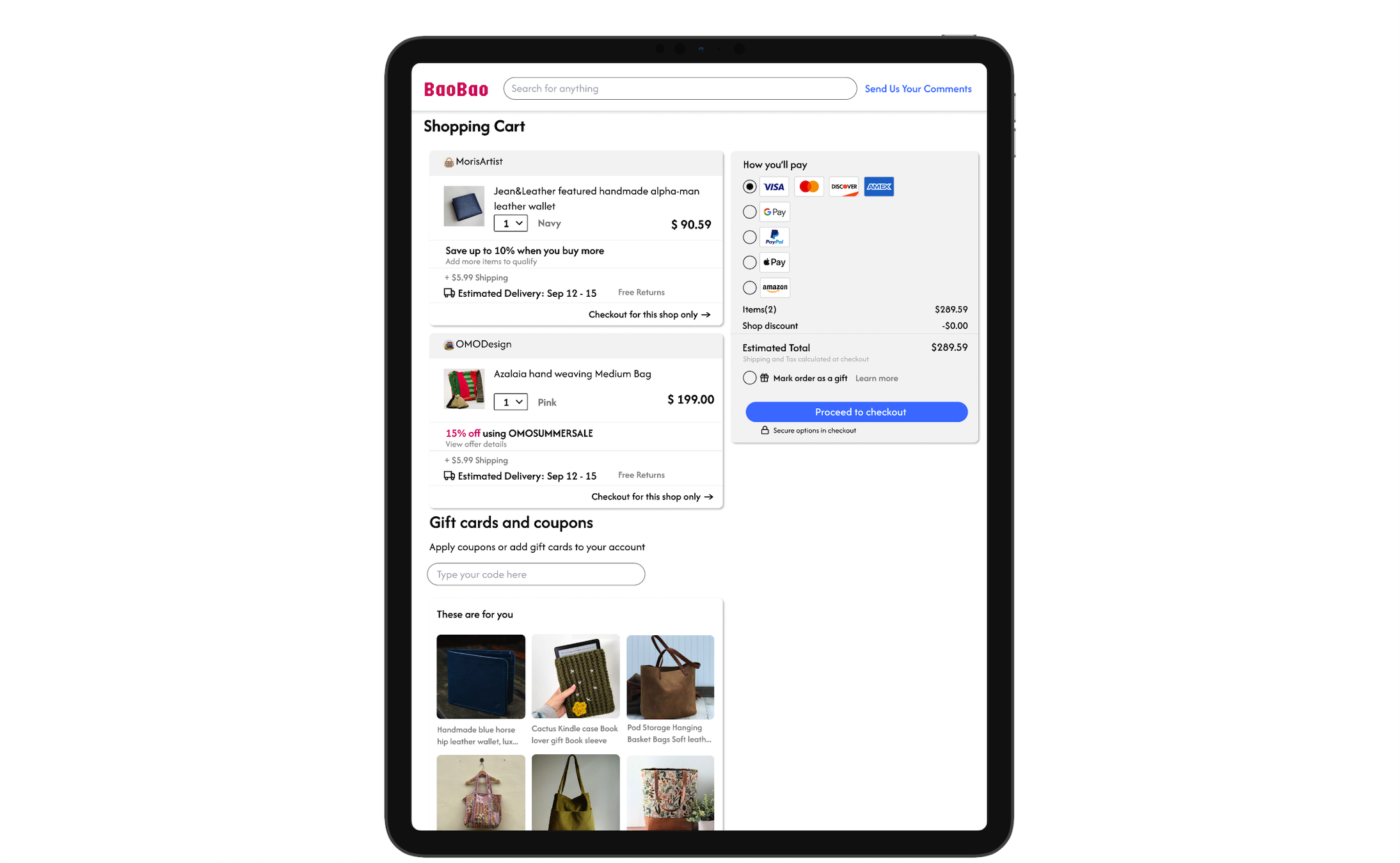
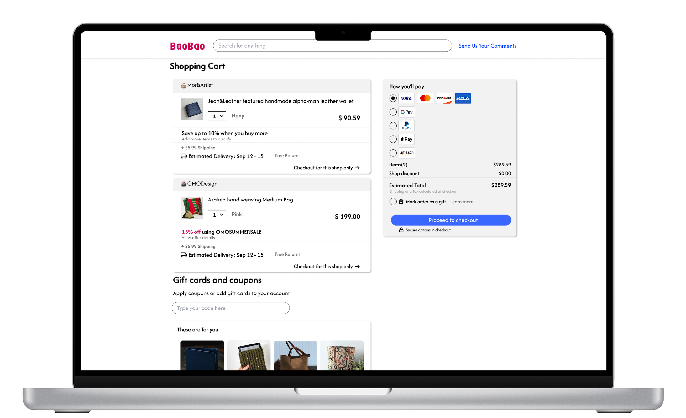
This design is fully responsive across devices — from mobile to desktop — ensuring a seamless checkout experience everywhere. Use the left and right arrows to explore how the interface adapts.
One-Page Checkout, 3x Faster Completion Time.
Before
After
Smarter Forms, 2x Higher Completion Rates
Accessible for All, Optimized for Every Screen.
The old checkout flow has too many screens, too many steps, too much thinking.
Users got overwhelmed — and left before completing checkout.
User effort dropped significantly — leading to higher satisfaction and retention.
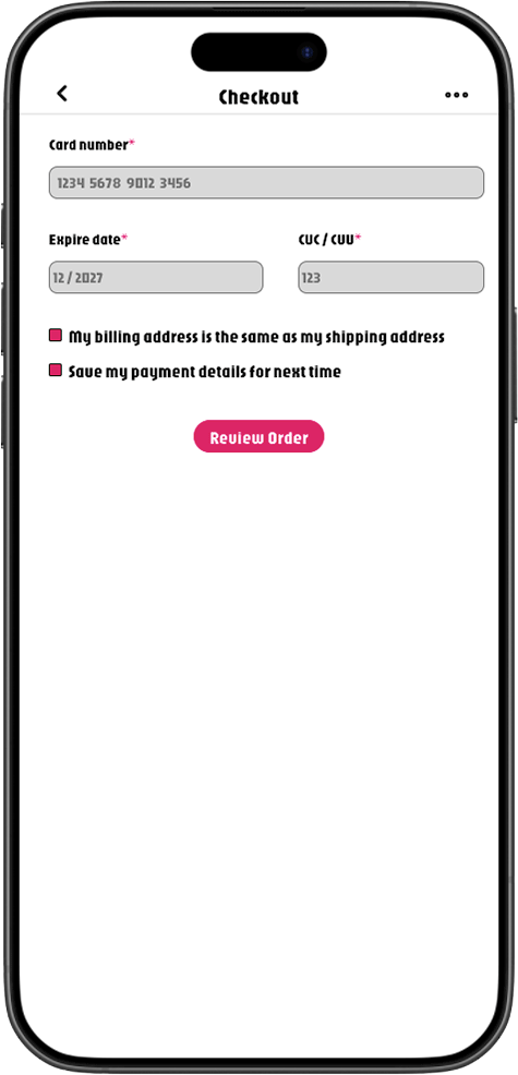
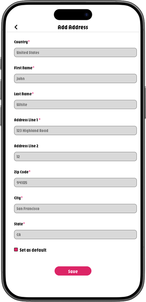
Reduced input pressure with scrollable country picker and auto-defaults.
→ 22% faster form start rate and lower abandonment at the first field.
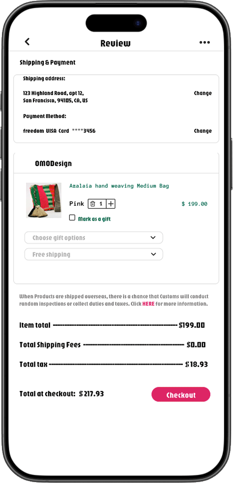
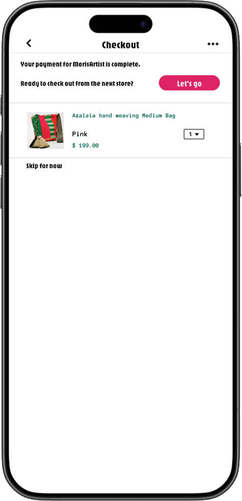
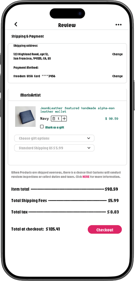
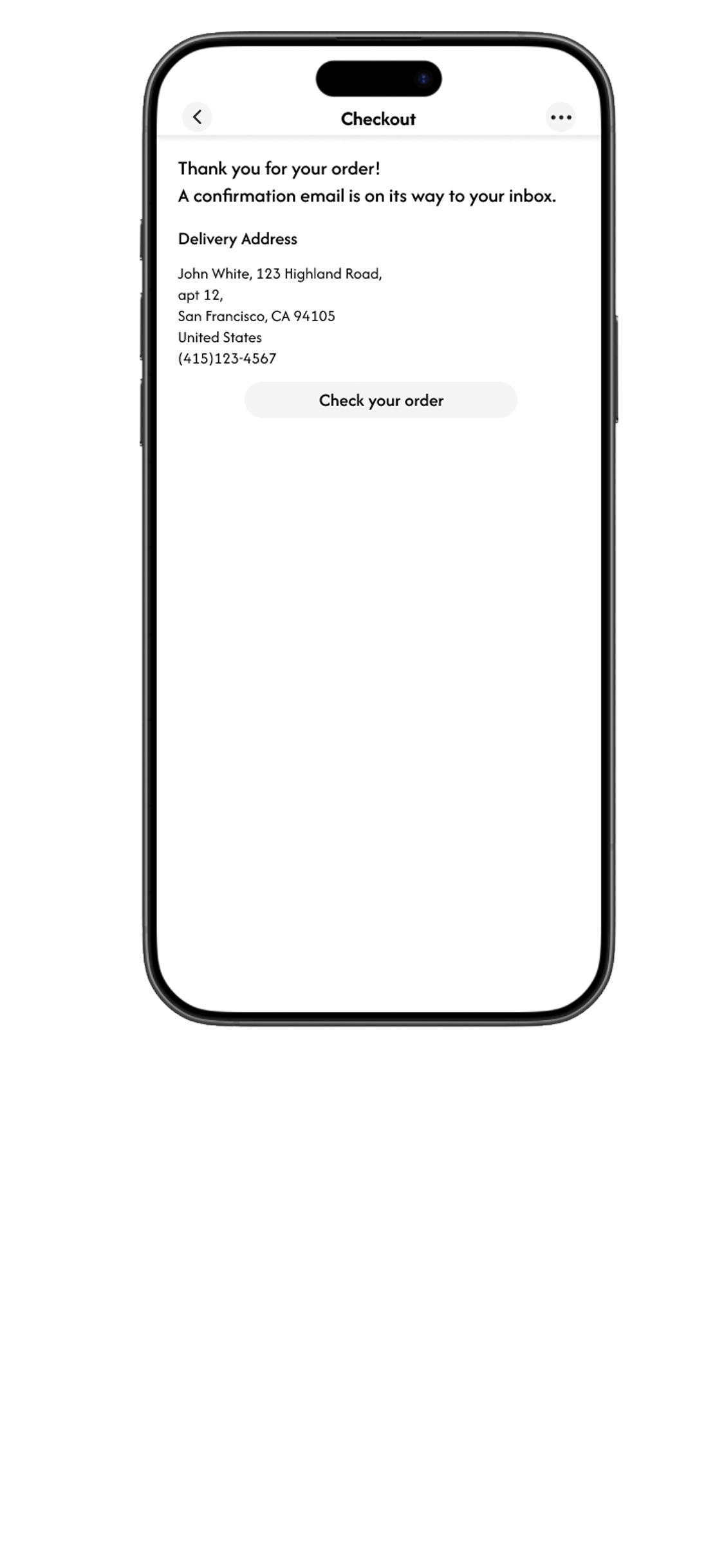
One page. Minimal taps. No back-and-forth.
The smoothest experience yet — 3× faster and dramatically higher completion rate.
Smart validation catches mistakes without breaking the flow.
→ 40% fewer drop-offs due to input errors. No reloads, no friction.
Before
After
Accelerated checkout with real-time address suggestions.
→ Cut manual typing by 68%, driving a 35% increase in address form completion.
Typography Hierarchy
Clear sizing, comfortable spacing, focused visual rhythm
Payment Indicators
Apple Pay/PayPal options + trusted brand logos
Security Cues
encryption lock icon
Visual Tone
Consistent, calm, and professionally handcrafted feel
04. Impact & Reflection
Simplicity, Clarity, and Trust Drive Conversion.
Less Friction, Fewer Errors, More Success.
What I Learned:
Clarity is not optional — users need to know where they are, what’s next, and that they’re safe.
Friction hides in small details — repeated forms, inconsistent labels, even subtle trust gaps.
Visual polish builds confidence, especially for first-time buyers or mobile users.
Trust is not told, it’s shown — through layout, labels, and system behavior.
What I’d Do Differently Next Time
Incorporate user testing earlier, especially to validate emotional tone and trust perception
Add real-time analytics feedback loops, to adjust checkout logic based on user behavior
Explore microinteractions and transitions to further reduce anxiety at payment moments
Final Takeaway:
Reducing friction isn’t just good UX — it’s good business.
Every second saved and every doubt removed can be the difference between drop-off and conversion.
Immediate disruption
Impact
As an early stage startup fresh on the scene, purple space has made a significant impact with the stick of its users. let’s figure out the impact and influence of the app and see if it is helping its users in some ways they love to hear.
2X
replaced by the impact
28%
Checkout Completion Rate
24K
replaced by the impact
24K
replaced by the impact

