AIOne
AIONE is a one-stop AI creation platform that consolidates multiple engines into a single effortless workflow. By unifying scattered tools into one smooth, intuitive workspace, it gives users a fast, seamless way to explore ideas, create, and stay in a clear and simple flow.
Project Type
Product Design
Design Stage
Startup
Deliverables
Motion design system, UI Kit, Applied Motion Design, motional Support Strategy, Product Design
Uncharted Territory. Untamed Users.Unstructured Tools.
In our mixed-method study, we find out 3 key insights:
Users need centralized result tracking, clear pricing, and consistent UI hierarchy to stay in control;
Users need a streamlined workflow that remembers their progress and reduces repetitive actions;
Users need proactive guidance—not more choices—to navigate with confidence.
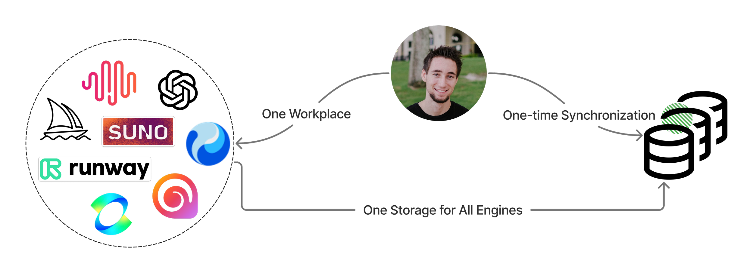
We consolidated scattered AI tools into one coherent workspace—eliminating the need for repeated logins, manual file transfers, and fragmented outputs.
Clear entry points and streamlined task flows helped users get started faster and stay in flow, reducing cognitive friction and boosting early retention.
One-Step Entry
We used a focused palette, dynamic gradients, and subtle motion cues to express AIONE’s intelligence and fluidity. Every interaction reinforces clarity, guiding users through complex AI capabilities with ease.
The result is an interface that feels cohesive, responsive, and intentionally crafted—reflecting AIONE’s goal of making advanced creation feel simple.
01.Overview
1 Designer
3 Engineers
3 Months
In early 2024, I joined a lean, cross-functional team to reimagine how users engage with generative AI.
Our research revealed a common struggle: too many tools, disjointed workflows, and cognitive overload were blocking creativity and discouraging adoption.
I saw an opportunity—not to add features, but to design clarity. We set out to build a unified, intuitive, and scalable experience that lowers the learning curve for new users and keeps power users in flow.
This was more than a UX challenge—it was a product strategy move: helping our client stand out in a crowded AI market by turning confusion into confidence, and friction into long-term engagement.
02.Challenge
Complex Flows Broke Trust and Momentum
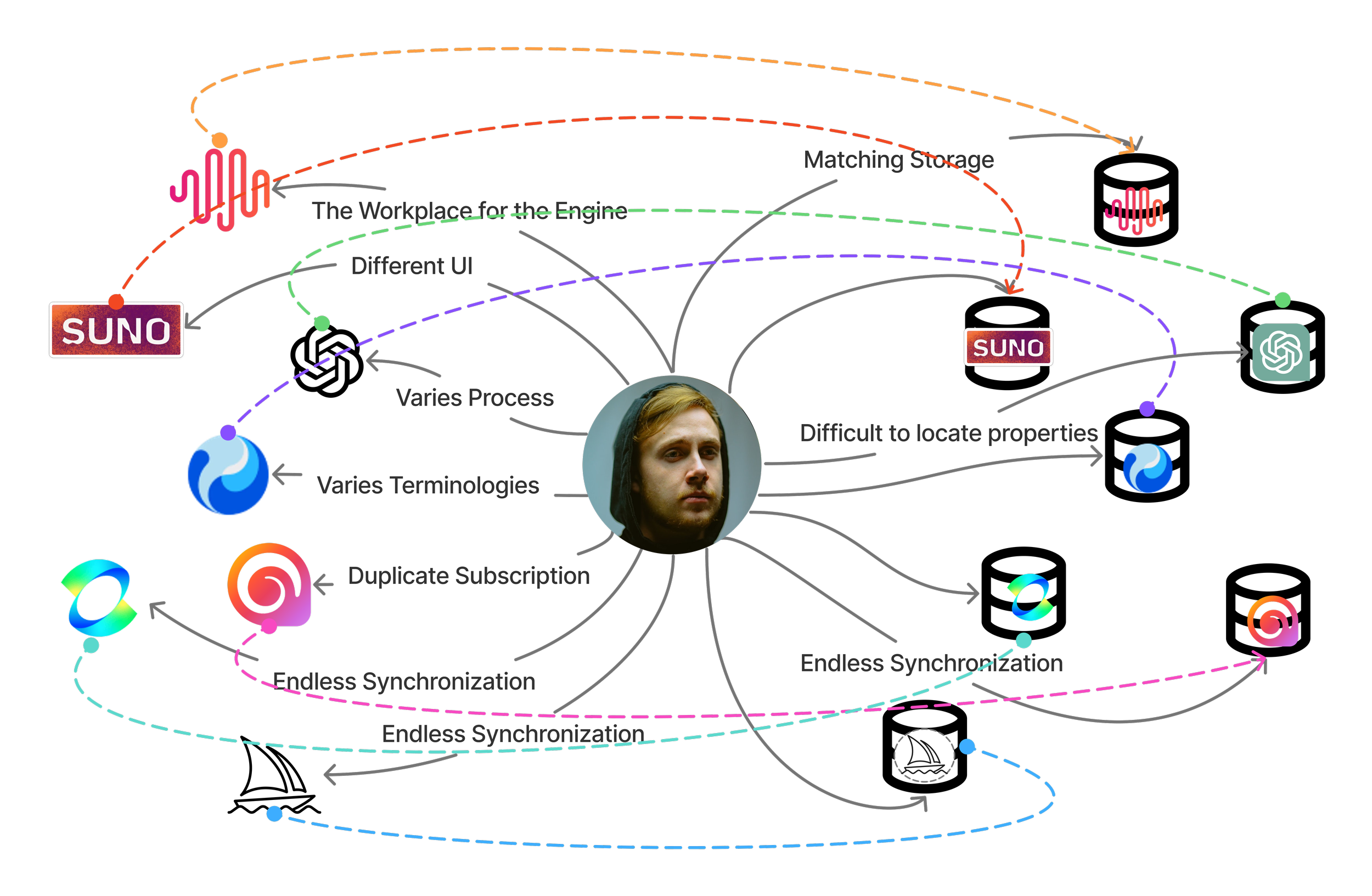
In our mixed-method study (survey + 1:1 interviews), 4 of 6 users reported juggling 2–4 AI tools per task.
This constant tool-switching caused context loss, repeated uploads, and scattered outputs—disrupting creative flow.
Without clear guidance or unified steps, user drop-off increased at every stage.
AI Adoption Outpaced User Understanding
User interviews and surveys revealed a clear gap between tool availability and user readiness.
While interest in generative AI was high, many users didn’t know where to start, what each tool did, or how to use them together—often stalling before taking the first step.
Disconnected Outputs Undermined Usability
Usability tests and task-based interviews revealed users struggled to manage results across multiple AI platforms.
Without a unified asset system, they lost track of what was created where—resorting to screenshots, folders, or recreating content.
Subscriptions scattered across tools added cost without clarity, further eroding trust and momentum.
03.Insight & Strategy
+32% Subscription Conversion
+60% Early Engagement
+35% Task Success Rate
Key Insight 1 : Users need centralized result tracking, clear pricing, and consistent UI hierarchy to stay in control.
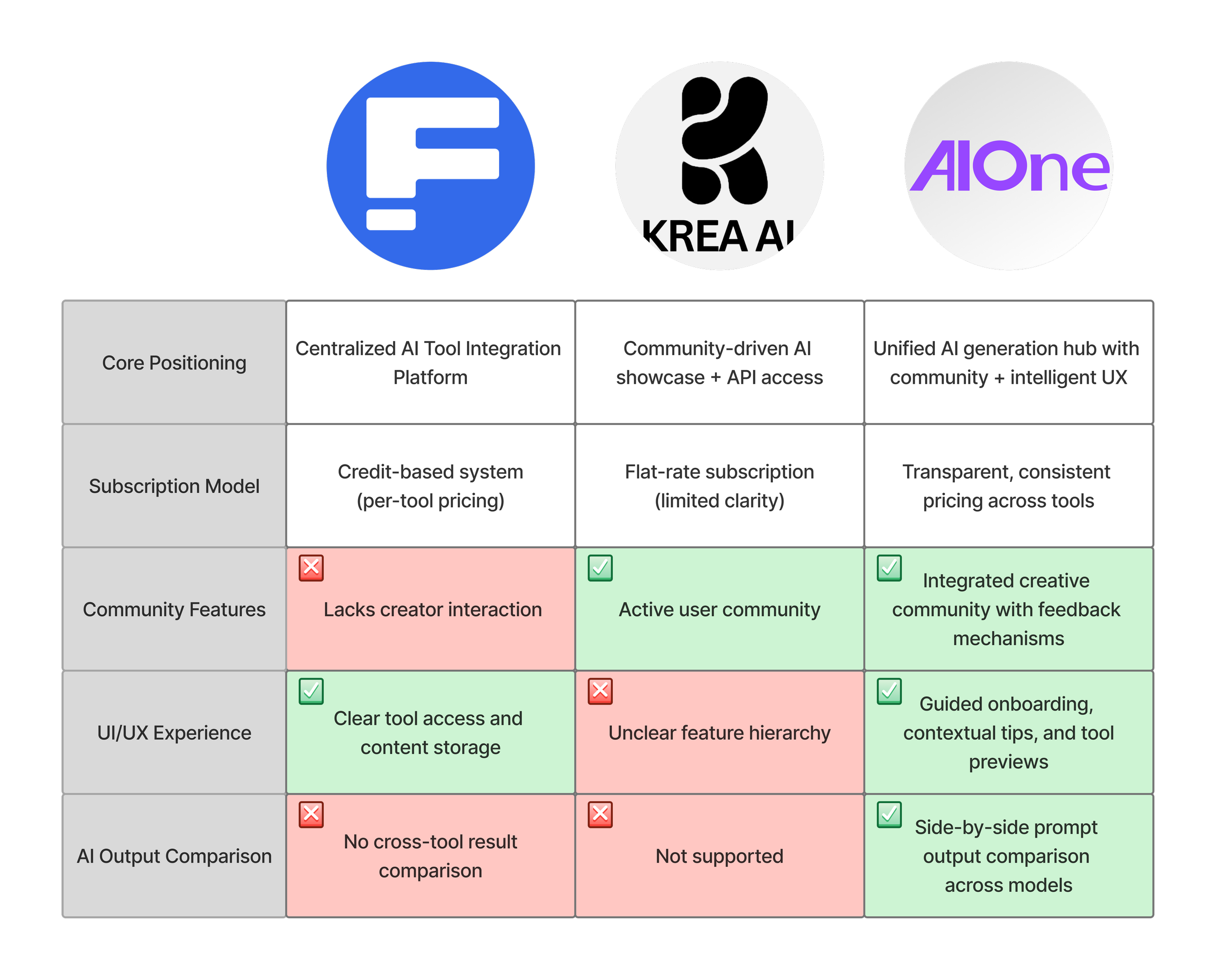
We conducted a competitive feature audit and UX walkthroughs of leading AI creation platforms (Freepik AI, Krea AI) to understand how tool integration affects user clarity, control, and confidence in creation. Fragmented tools, scattered outputs, and unclear credit systems forced users to manually manage assets—creating mental load and disrupting creative momentum.
Key Insight 2 : Users need a streamlined workflow that remembers their progress and reduces repetitive actions.
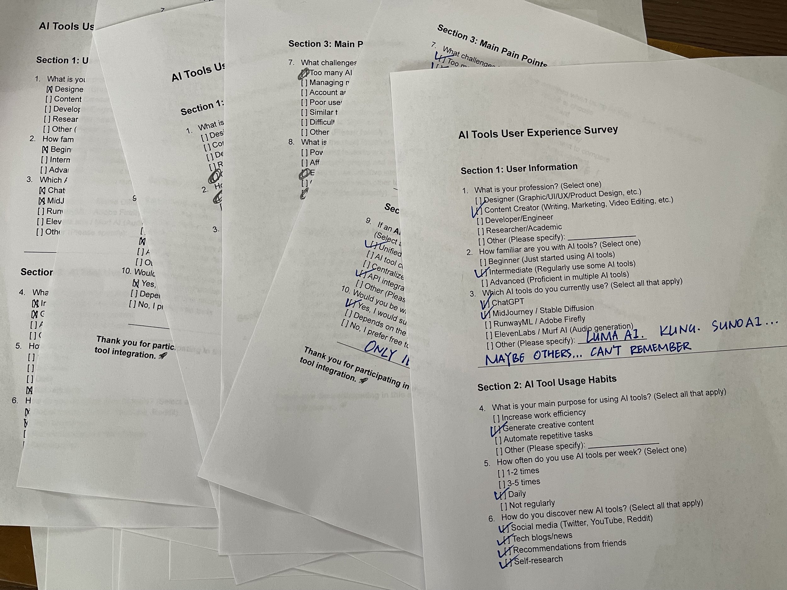
We conducted a mixed-method study combining:
Task-based usability tests with 6 participants;
A quantitative survey of 30 users;
In-depth interviews focused on workflow breakdowns.
We found frequent re-uploads, repeated logins, and tool-switching drained time and energy. A coherent, memory-based system can preserve context and keep users in flow.
Responsive chart with hover-to-reveal details and tap support.
Key Insight 3 : Users need proactive guidance—not more choices—to navigate with confidence.
Instead of facing blind decisions, users benefit from template-based starting points, explained features, and visual previews that clarify consequences before they act.
Uncharted Territory.
Untamed Users.
Unstructured Tools.
Control, not clutter.
Recognition, not repetition.
Guidance, not guesswork.
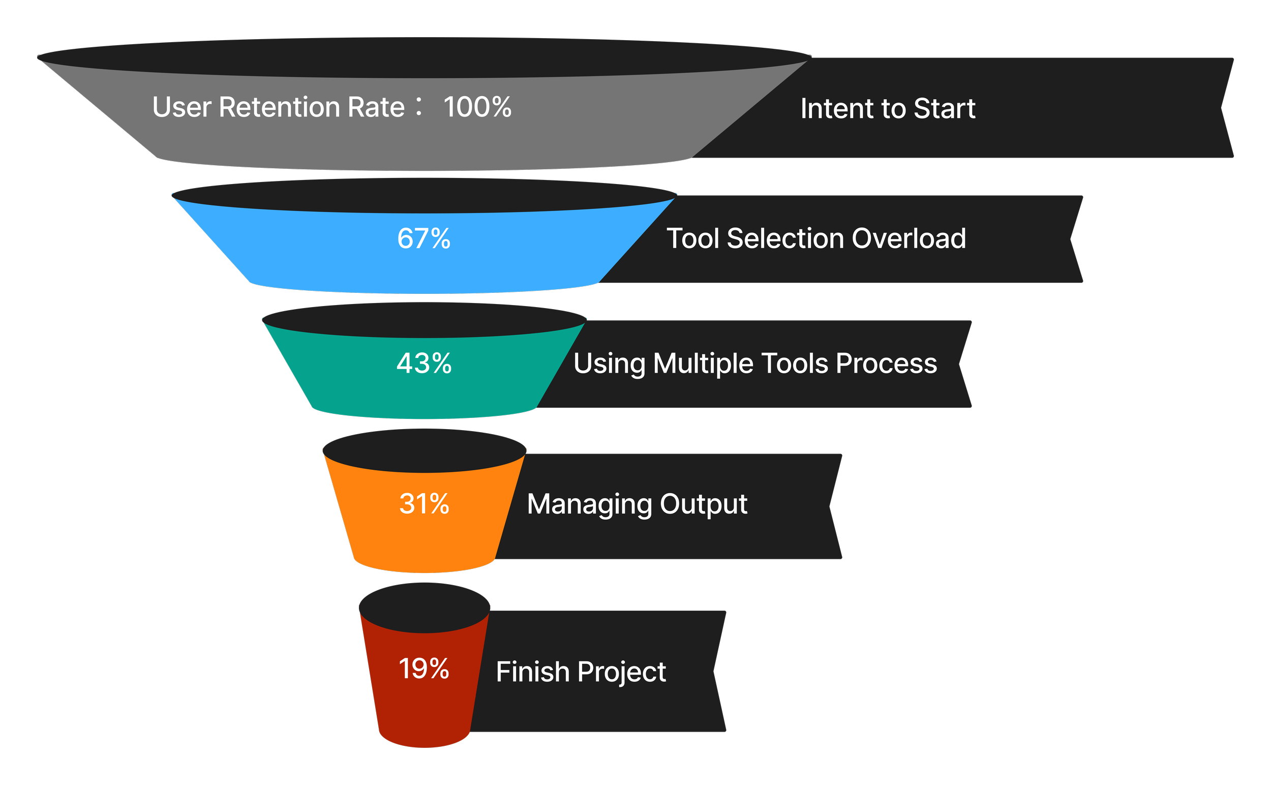
Untamed user has a hard time in nowadays AI world.
Funnel Analysis showing drop-off points and friction.
use competitor analysis head-to-head feature matrix
04.Solution
These results reflect not just better usability—but higher confidence, smoother onboarding, and more sustained user momentum.
We anchored our decisions in high-quality, mixed-method research:
30-person quantitative survey across diverse user types
10 in-depth interviews exploring first-run experience, pain points, and needs
Heatmaps + funnel analysis identifying friction and drop-off points
Competitive analysis comparing feature coverage, UI complexity, and mental model alignment
Lo-fi and hi-fi usability tests at multiple stages to validate and refine our flow
Our process prioritized clarity, emotional confidence, and strategic alignment—ensuring the product was not just usable, but meaningful and trusted.
+35%
increase in task success rate across core flows
+25%
decrease in user-reported confusion around tool selection
Simplify the Flow.
Guide the Journey.
Foster the Community.
We consolidated scattered AI tools into one coherent workspace—eliminating the need for repeated logins, manual file transfers, and fragmented outputs.
Clear entry points and streamlined task flows helped users get started faster and stay in flow, reducing cognitive friction and boosting early retention.
one coherent workspace—eliminating the need for repeated logins, manual file transfers, and fragmented outputs.
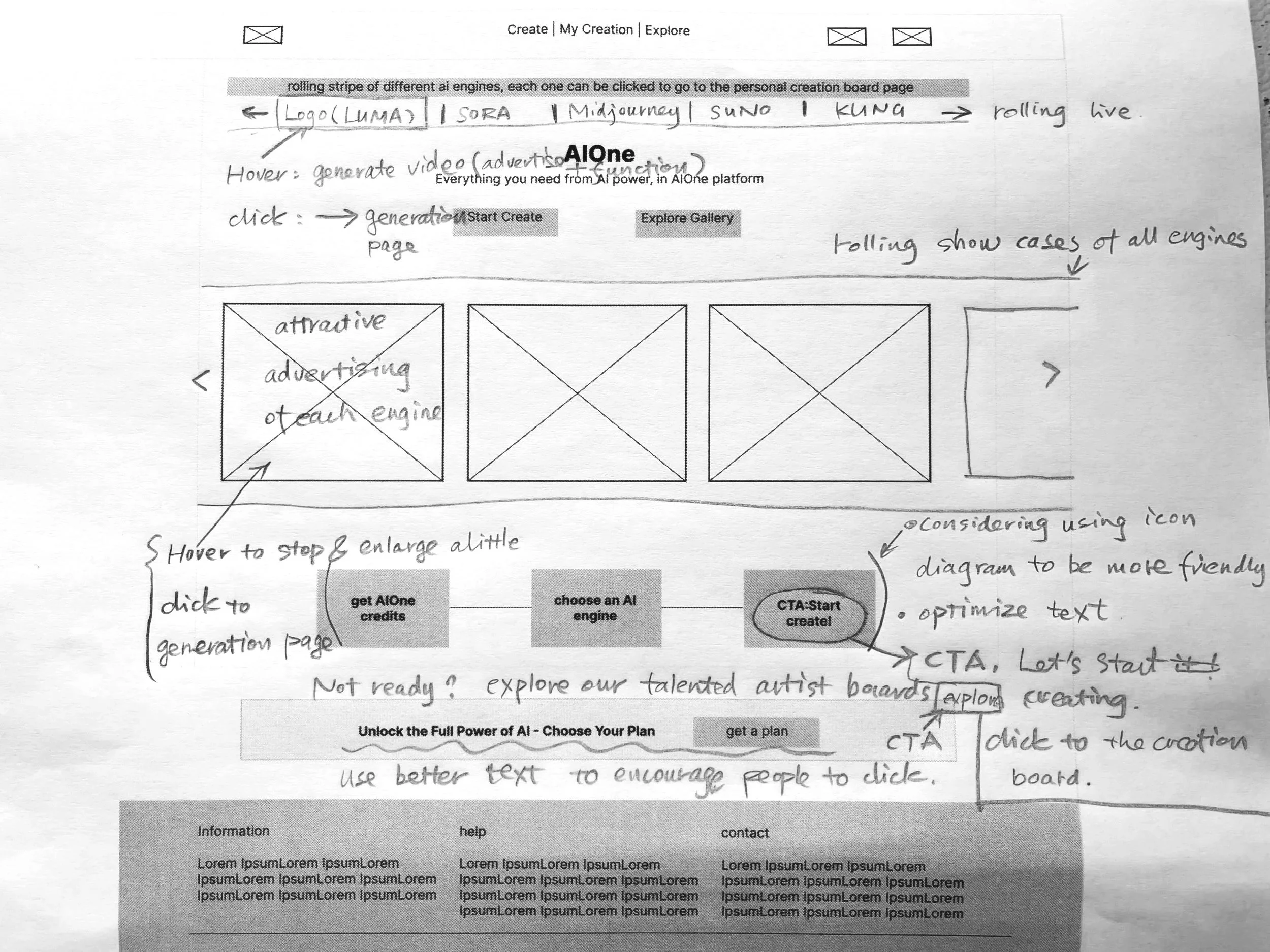
By offering multiple clear entry points and a one-step transition into the workspace, we minimized drop-off and improved early-stage retention.
We designed an experience where:
every icon is explained,
every action has feedback,
and no interaction leads to a dead end.
Contextual tips, AI-assisted suggestions, and transparent credit usage gave users control, clarity, and confidence—especially as the platform evolved with new features.
We embedded lightweight social features—personal IDs, likes, remixable outputs, and achievement rewards—to turn creation into shared momentum.
These elements deepened engagement and encouraged users to return, connect, and contribute within a growing creative ecosystem.
05.Impact & Reflection
Reflect. Refine. Repeat.
Early Validation through Research & Low-Fi Testing.
What Worked
Our iterative design decisions led to tangible improvements across multiple user experience and business metrics:
+60%
increase in early user engagement during usability tests
+40%
reduction in internal product decision-making time
+45%
onboarding completion rate during prototype testing
+28%
improvement in workflow clarity, based on user self-assessments
What I Learned
Human Needs > AI Hype
Clarity beats complexity. In fast-evolving AI spaces, users seek structure and confidence, not more features.
Overload creates emotion, not just friction. Confusion and fatigue stem from poor UX, not lack of tools.
Guidance builds trust. Clear paths and intuitive flows outperform even the most powerful functionality.
+32%
higher likelihood of subscription conversion (self-reported)
Projected +30–50%
increase in retention vs. single-function AI tools
What‘s Next
If I had the chance to do it again, I’d design not just for what the product is—but for what it might become. That means anticipating how AI tools evolve, how user behaviors shift, and how to create systems that grow with them.
Looking ahead, here’s what I’d focus on:
1. Make onboarding evolve with the product
Auto-updating guidance, so users always feel supported—even as features change.
2. Add meaningful rewards to boost momentum
Use lightweight badges or streaks to encourage creative habits and deeper engagement.
3. Help users build lasting creative identities
Go beyond utility—give users personal spaces to save, remix, and proudly share their work.
>
Human Needs > AI Hype
Before
After


